
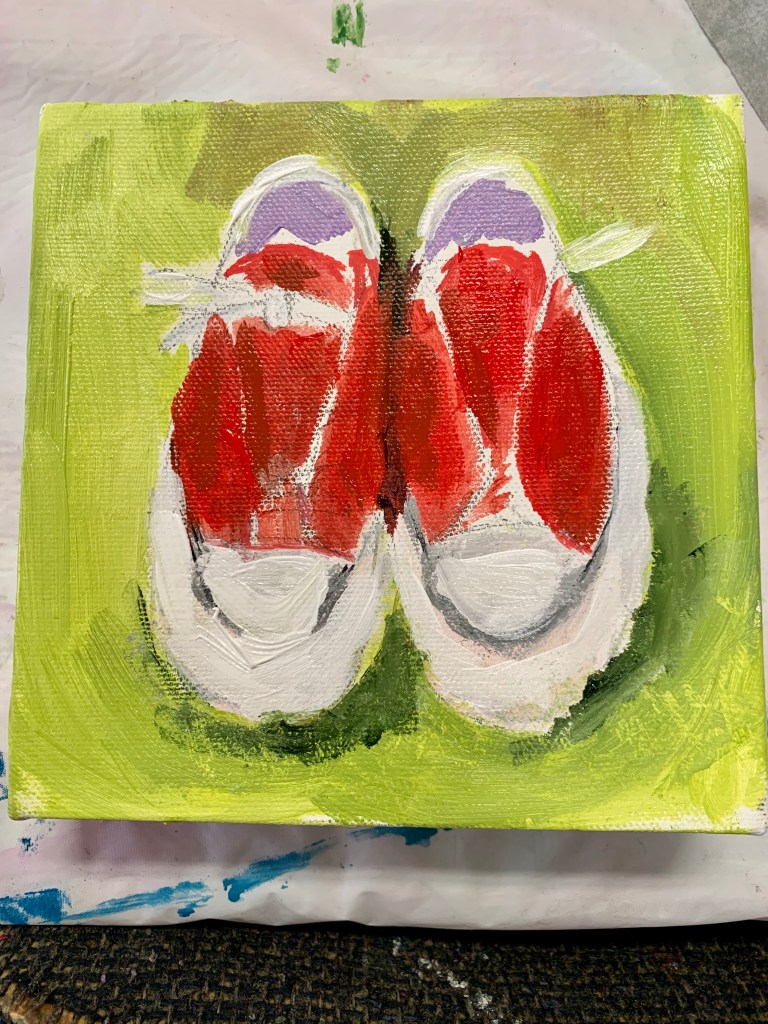
For me, this is how it typically starts when doing a still life. I like to make sure that the background color feels right. This is a classic case of using the complimentary color (red and green). It is also the time when I step back and make sure that I like the positioning/composition of the objects. I will add more details as I go!
